
博文
Data Types: undefined, null, boolean, string, symbol, number, and object
/* Data Types: undefined, null, boolean, string, symbol, number, and object */ <! DOCTYPE html > < html lang = "en" > < head > < meta charset = "UTF-8" > < meta http-equiv = "X-UA-Compatible" content = "IE=edge" > < meta name = "viewport" content = "width=device-width, initial-scale=1.0" > < title > Document </ title > </ head > < body > < script > console . log ( 'hello world!' ) var myName = "Beau" myName = 8 let ourName = "freeCodeCamp" const pi = 3.14 </ script > </ body > </ html >
javascript document.getElementById('d1').innerHTML= fn(2,3)
<! DOCTYPE html > < html lang = "en" > < head > < meta charset = "UTF-8" > < meta http-equiv = "X-UA-Compatible" content = "IE=edge" > < meta name = "viewport" content = "width=device-width, initial-scale=1.0" > < title > Document </ title > </ head > < body > < p id = "d1" ></ p > < script > function fn ( x , y ){ return x * y } document . getElementById ( 'd1' ). innerHTML = fn ( 2 , 3 ) </ script > </ body > </ html >
text-shadow box-shadow
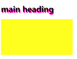
/* text-shadow box-shadow */ INDEX.HTML: <! DOCTYPE html > < html lang = "en" > < head > < meta charset = "UTF-8" > < meta http-equiv = "X-UA-Compatible" content = "IE=edge" > < meta name = "viewport" content = "width=device-width, initial-scale=1.0" > < title > CSS Tutorial </ title > < link rel = "stylesheet" href = "styles.css" > </ head > < body > < h1 > main heading </ h1 > < div class = "box" > </ div > </ body > </ html > CSS: /* text-shadow box-shadow */ h1 { text-shadow : 3px 3px 3px red ; /* https: //css3gen.com/text-shadow/ */ text-shadow : 3px 4px 2px rgba ( 255 , 11 , 179 , 1 ); } .box { width : 300px ; height : 150px ; ...
Font-Awesome Icons

/* ICONS Font-Awesome Icons Free,Easy to get up running, simple syntax */ INDEX.HTML: <! DOCTYPE html > < html lang = "en" > < head > < meta charset = "UTF-8" > < meta http-equiv = "X-UA-Compatible" content = "IE=edge" > < meta name = "viewport" content = "width=device-width, initial-scale=1.0" > < title > CSS Tutorial </ title > <!-- icons --> < script src = "https://kit.fontawesome.com/87ed342652.js" crossorigin = "anonymous" ></ script > < link rel = "stylesheet" href = "styles.css" > </ head > < body > < i class = "fas fa-home fa-10x" ></ i > < span class = "social-icon" > < i class = "fab fa-facebook fa-3x" ></ i > </ span > ...
--varName:var(--varName)

/* CSS VARIBLES AKA Custom Properties hold a value and reuse it --varName:var(--varName) scope :root{} === global element === local any property */ INDEX.HTML: <! DOCTYPE html > < html lang = "en" > < head > < meta charset = "UTF-8" > < meta http-equiv = "X-UA-Compatible" content = "IE=edge" > < meta name = "viewport" content = "width=device-width, initial-scale=1.0" > < title > CSS Tutorial </ title > < link rel = "stylesheet" href = "styles.css" > </ head > < body > < h1 class = "heading" > main heading </ h1 > < p class = "text" > Lorem ipsum dolor sit amet consectetur adipisicing elit. Nemo culpa optio voluptatum ea at consequatur. </ p > < div class = "main" > < p class = "main-text" > ...
animation-fill-mode

/* animation-fill-mode:what values are applied by the animation outside the time it is executing */ INDEX.HTML: <! DOCTYPE html > < html lang = "en" > < head > < meta charset = "UTF-8" > < meta http-equiv = "X-UA-Compatible" content = "IE=edge" > < meta name = "viewport" content = "width=device-width, initial-scale=1.0" > < title > CSS Tutorial </ title > < link rel = "stylesheet" href = "styles.css" > </ head > < body > < div class = "animation" > animation </ div > </ body > </ html > CSS: /* animation-fill-mode:what values are applied by the animation outside the time it is executing */ div { width : 200px ; height : 100px ; color : white ; margin : 10px ; } .animation { background : green ; ...
Transition ANIMATION 0 1% 2% ..... 100%

/* Transition 0 = 100% ANIMATION 0 1% 2% ..... 100% */ INDEX.HTML: <! DOCTYPE html > < html lang = "en" > < head > < meta charset = "UTF-8" > < meta http-equiv = "X-UA-Compatible" content = "IE=edge" > < meta name = "viewport" content = "width=device-width, initial-scale=1.0" > < title > CSS Tutorial </ title > < link rel = "stylesheet" href = "styles.css" > </ head > < body > < div class = "transition" > transition </ div > < div class = "animation" > animation </ div > </ body > </ html > CSS: /* Transition 0 = 100% ANIMATION 0 1% 2% ..... 100% */ div { width : 200px ; height : 100px ; color : white ; margin : 10px ; } .transition { background : red ; trans...
transition-timing-function:ease linear ease-in ease-out ease-in-out

/* how the transition takes place transition-timing-function: transition:all 3s here 5s; ease = default ease = slow start, fast,slow end linear = same speed start to end ease-in = slow start ease-out =s slow end ease-in-out = slow start, fast, slow end */ INDEX.HTML: <! DOCTYPE html > < html lang = "en" > < head > < meta charset = "UTF-8" > < meta http-equiv = "X-UA-Compatible" content = "IE=edge" > < meta name = "viewport" content = "width=device-width, initial-scale=1.0" > < title > CSS Tutorial </ title > < link rel = "stylesheet" href = "styles.css" > </ head > < body > < div class = "default" > default </ div > < div class = "ease" > ease </ div > < div class = "linear" > linear </ div > < div class = "ea...
transition-property::after transiton-duration:
/* transition:change over time transition-property::after transiton-duration: */ INDEX.HTML: <! DOCTYPE html > < html lang = "en" > < head > < meta charset = "UTF-8" > < meta http-equiv = "X-UA-Compatible" content = "IE=edge" > < meta name = "viewport" content = "width=device-width, initial-scale=1.0" > < title > CSS Tutorial </ title > < link rel = "stylesheet" href = "styles.css" > </ head > < body > < div class = "one" > </ div > < div class = "two" > </ div > < div class = "three" > <!-- Hello. This is a DIV element. --> </ div > </ body > </ html > CSS: /* transition:change over time transition-property::after...
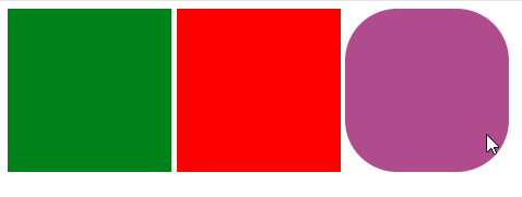
transform : translate(),scale(),rotate(),skew()

/* transform : translate(),scale(),rotate(),skew() */ INDEX.HTML: <! DOCTYPE html > < html lang = "en" > < head > < meta charset = "UTF-8" > < meta http-equiv = "X-UA-Compatible" content = "IE=edge" > < meta name = "viewport" content = "width=device-width, initial-scale=1.0" > < title > CSS Tutorial </ title > < link rel = "stylesheet" href = "styles.css" > </ head > < body > < div class = "one" > </ div > < div class = "two" > </ div > < div class = "three" > Hello. This is a DIV element. </ div > </ body > </ html > CSS: /* transform : translate(),scale(),rotate(),skew() */ div { width : 150px ; ...
CSS3 :root 选择器 设置HTML文档的背景色:

/* :Root root element of the document html element general styles css variables */ INDEX.HTML: <! DOCTYPE html > < html lang = "en" > < head > < meta charset = "UTF-8" > < meta http-equiv = "X-UA-Compatible" content = "IE=edge" > < meta name = "viewport" content = "width=device-width, initial-scale=1.0" > < title > CSS Tutorial </ title > < link rel = "stylesheet" href = "styles.css" > </ head > < body > < h1 > i'm heading </ h1 > < p class = "absolute" > Lorem ipsum dolor sit amet consectetur adipisicing elit. Ullam, tempore? Nobis nemo pariatur, harum veniam accusamus similique voluptatibus rem alias. </ p > < p class = "responsive" > ...
::first-line ::first-letter :hover :link :visited :hover :active

/* ::first-line ::first-letter */ /* :hover */ /* :link :visited :hover :active */ INDEX.HTML: <! DOCTYPE html > < html lang = "en" > < head > < meta charset = "UTF-8" > < meta http-equiv = "X-UA-Compatible" content = "IE=edge" > < meta name = "viewport" content = "width=device-width, initial-scale=1.0" > < title > CSS Tutorial </ title > < link rel = "stylesheet" href = "styles.css" > </ head > < body > < p > Lorem ipsum dolor sit amet consectetur adipisicing elit. Consequatur vero quasi explicabo soluta beatae dignissimos aut minima quia, deserunt facere. </ p > < div class = "header" > Lorem ipsum dolor sit amet consectetur adipisicing elit. Eius sa...
Descendant Child Selectors:
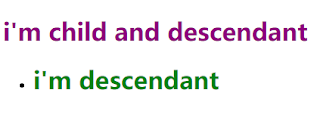
/* Descendant and Child combinators*/ INDEX.HTML: <! DOCTYPE html > < html lang = "en" > < head > < meta charset = "UTF-8" > < meta http-equiv = "X-UA-Compatible" content = "IE=edge" > < meta name = "viewport" content = "width=device-width, initial-scale=1.0" > < title > CSS Tutorial </ title > < link rel = "stylesheet" href = "styles.css" > </ head > < body > < div class = "header" > < h1 > i'm child and descendant </ h1 > </ div > < div class = "header" > < ul > < li >< h1 > i'm descendant </ h1 ></ li > </ ul > </ div > </ body > </ html > C...