transition-property::after transiton-duration:
/*
transition:change over time
transition-property::after
transiton-duration:
*/
INDEX.HTML:
<!DOCTYPE html>
<html lang="en">
<head>
<meta charset="UTF-8">
<meta http-equiv="X-UA-Compatible" content="IE=edge">
<meta name="viewport" content="width=device-width, initial-scale=1.0">
<title>CSS Tutorial</title>
<link rel="stylesheet" href="styles.css">
</head>
<body >
<div class="one">
</div>
<div class="two">
</div>
<div class="three">
<!-- Hello. This is a DIV element. -->
</div>
</body>
</html>
CSS:
/*
transition:change over time
transition-property::after
transiton-duration:
*/
div {
width: 150px;
height: 150px;
display: inline-block;
}
div:hover{
background:orange;
}
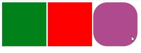
.one {
background: green;
}
.two {
background: red;
}
.three {
background: blue;
/* transition-duration: 4s, 2s; */
/* transition-delay: 3s; */
transition: all 4s 5s;
}
.three:hover {
border-radius: 50%;
background: coral;
}


评论
发表评论